

On every GitHub user's profile page, there is a graph that is hard to ignore:
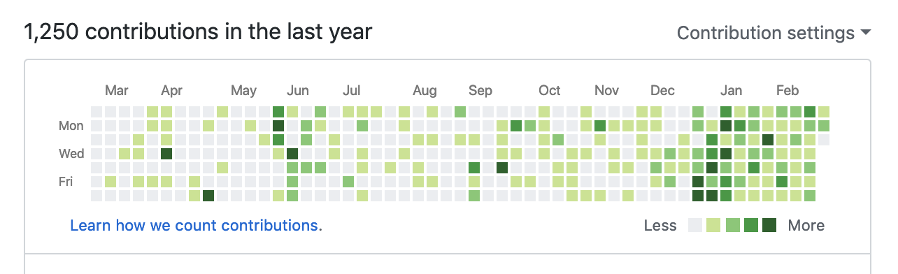
While there is controversy whether the graph is more harmful to developers (see discussion thread), I have always been curious the amount of commits needed to generate a certain color within the graph. And while the internet is great for finding random information like this, I was unsuccessful at finding it.
So, thankfully my GitHub contribution graph has a fair amount of variance in the data to allow me to figure it out.
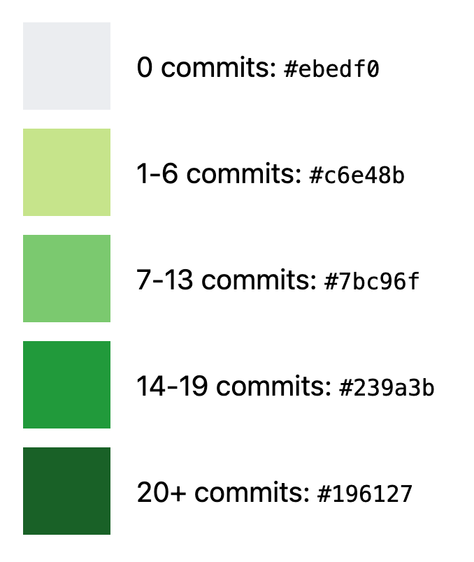
Contribution Square Legend
Contributions Are Not Created Equal
In case you didn't notice, the legend I generated above is based on "commits" rather than other contribution tasks like Issue creation and PRs. After talking with @TheAlexLichter, it suddenly made me realize that all contributions are not counted equally. As far as I can tell, committing code to a repository has the highest weight when it comes to how it impacts your contribution graph.
Final Thoughts
If it isn't obvious, I have been embarking to try and fill all of my squares for 2019. Is this gamification ultimately negative? Only time will tell. At the very least though, it has helped me to build a habit of working on something consistently rather than in one big swoop. I'll probably need a whole post dedicated to this, but that's for another time.
Till next time!